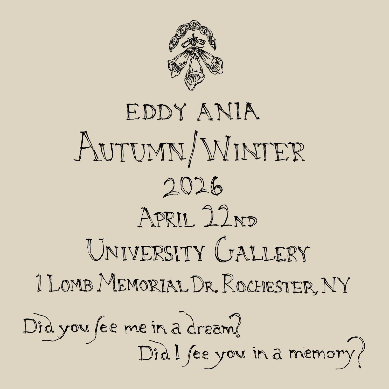
I began by looking at examples of handwriting and text from the 18th century from archived magazines and genealogy research and then I combined elements of both into a handwritten font for myself to use as a guide

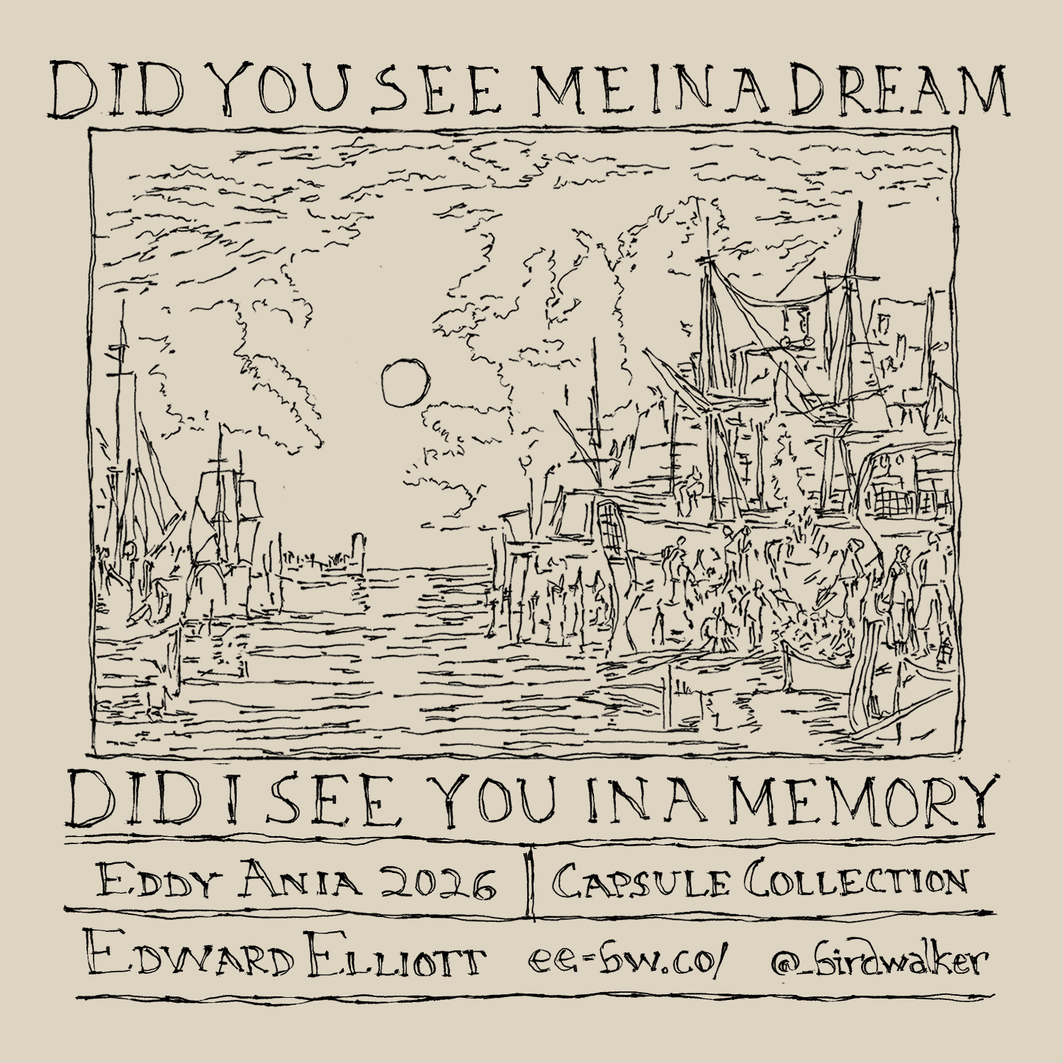
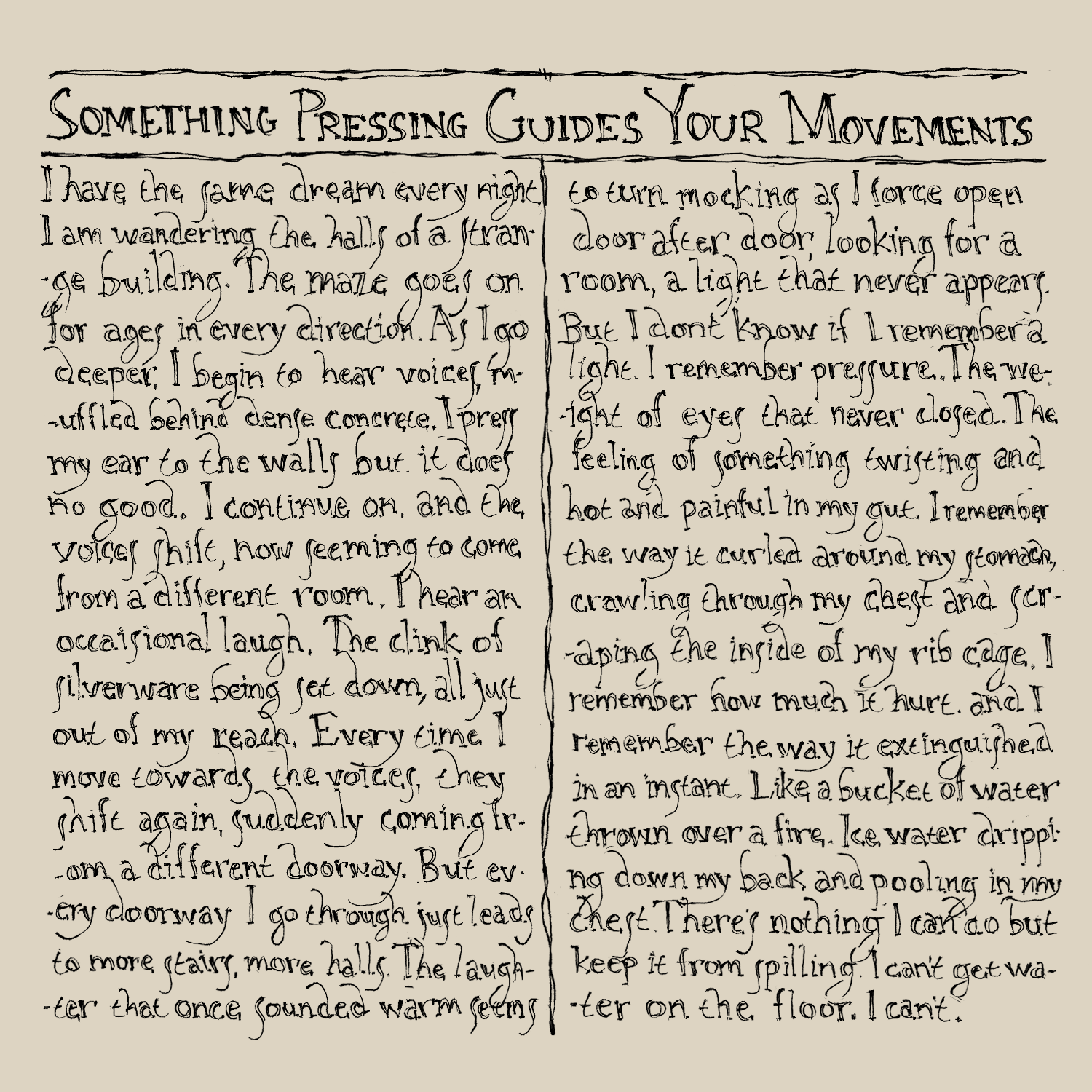
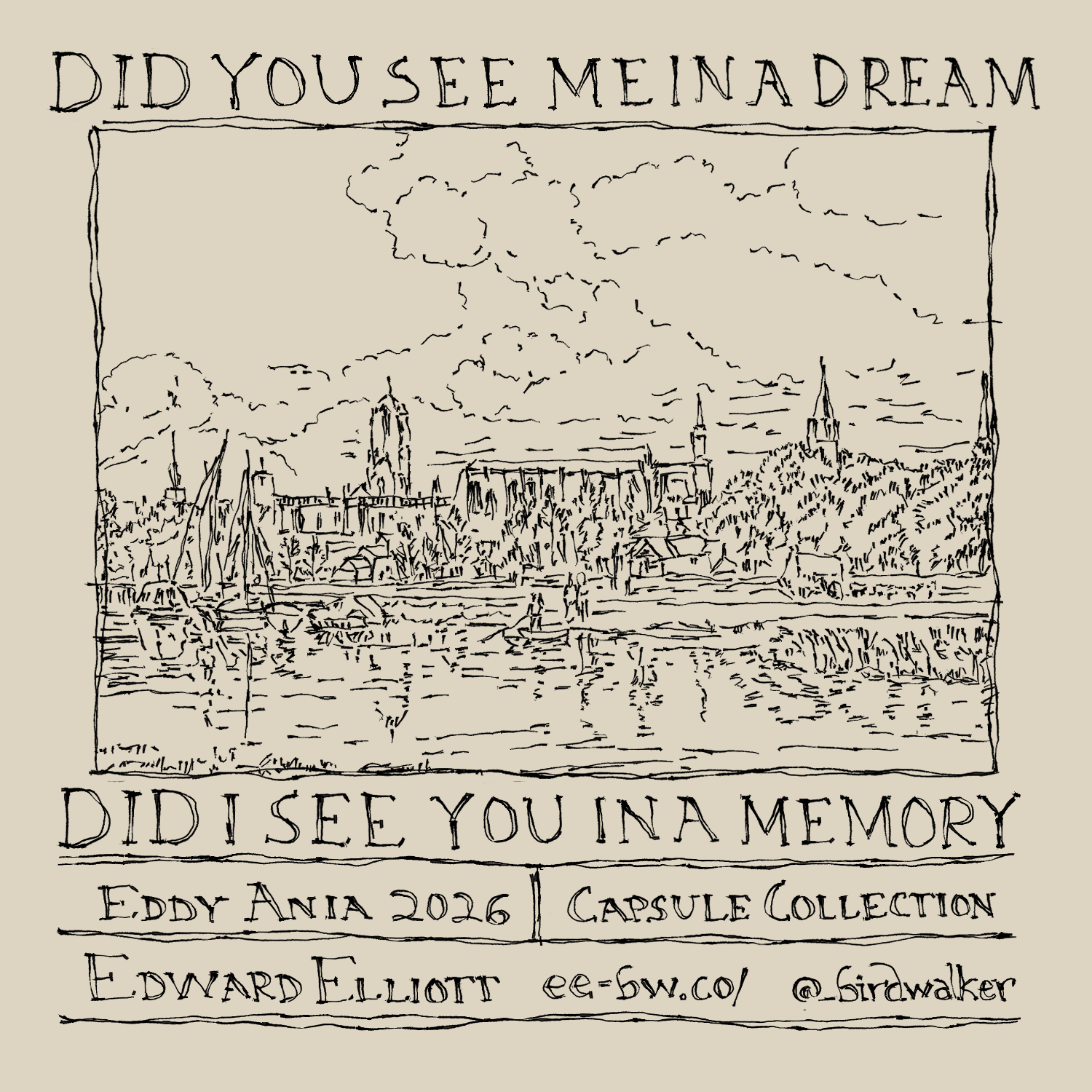
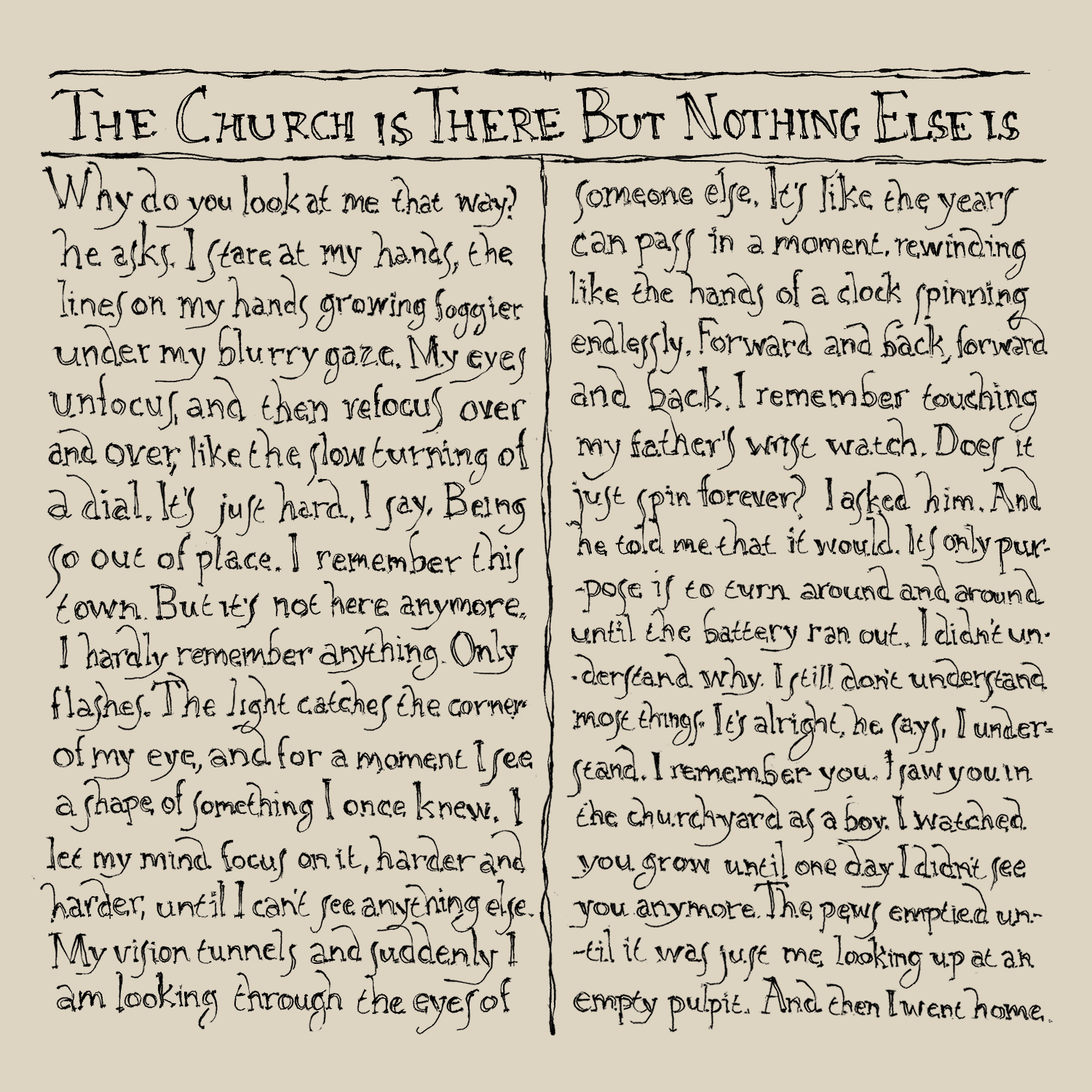
For the tag, I had the idea of printing or hand writing it on cloth and using the format of an old magazine cover page that I had found as inspiration. On the back I could add one of the short vignette writing pieces I've written to go along with the project.

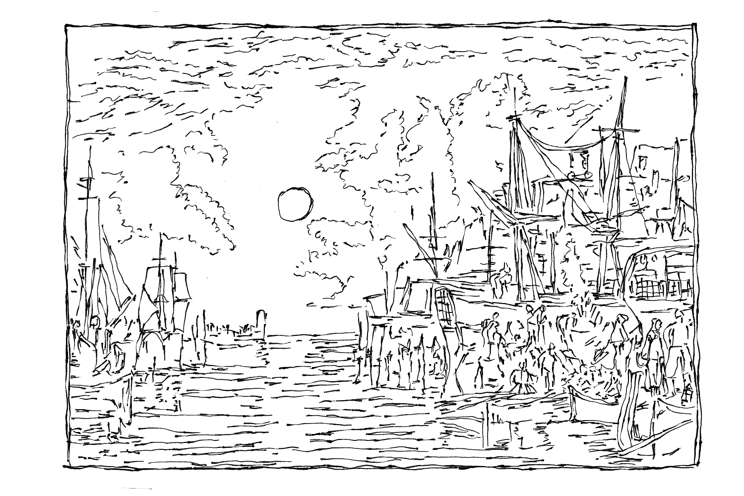
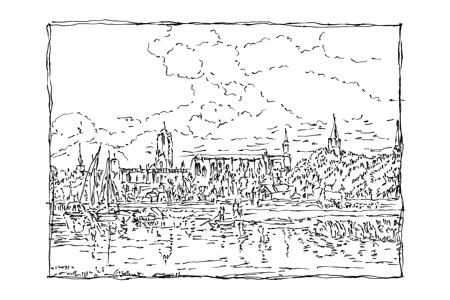
I was really inspired by the landscape works of a painter from the late 1700s named Joseph Mallord William Turner and decided to use those as the base for the drawings I would do for the tags.
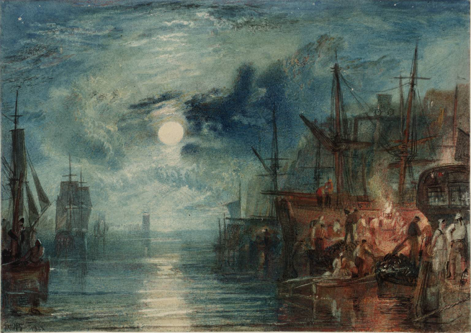
Shields, on the River Tyne, JMW Turner
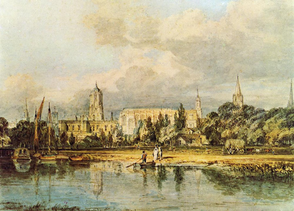
South View of Christ Church from the Meadows, JMW Turner
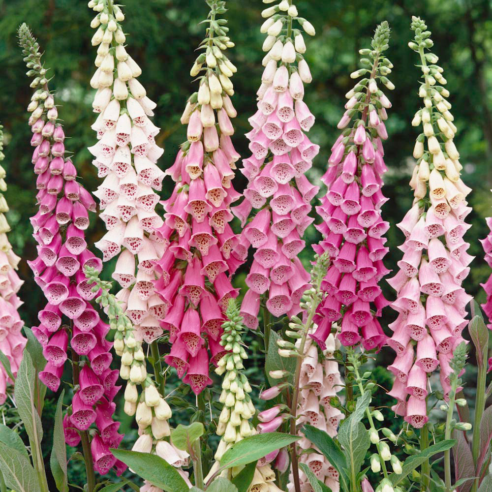
For the logo I wanted to continue using the motif of foxgloves to represent healing and harm intertwined. I had the idea to try and combine them with the historical british military insignia, the broad arrow or crow's foot. The bells of the flower look kind of similar.
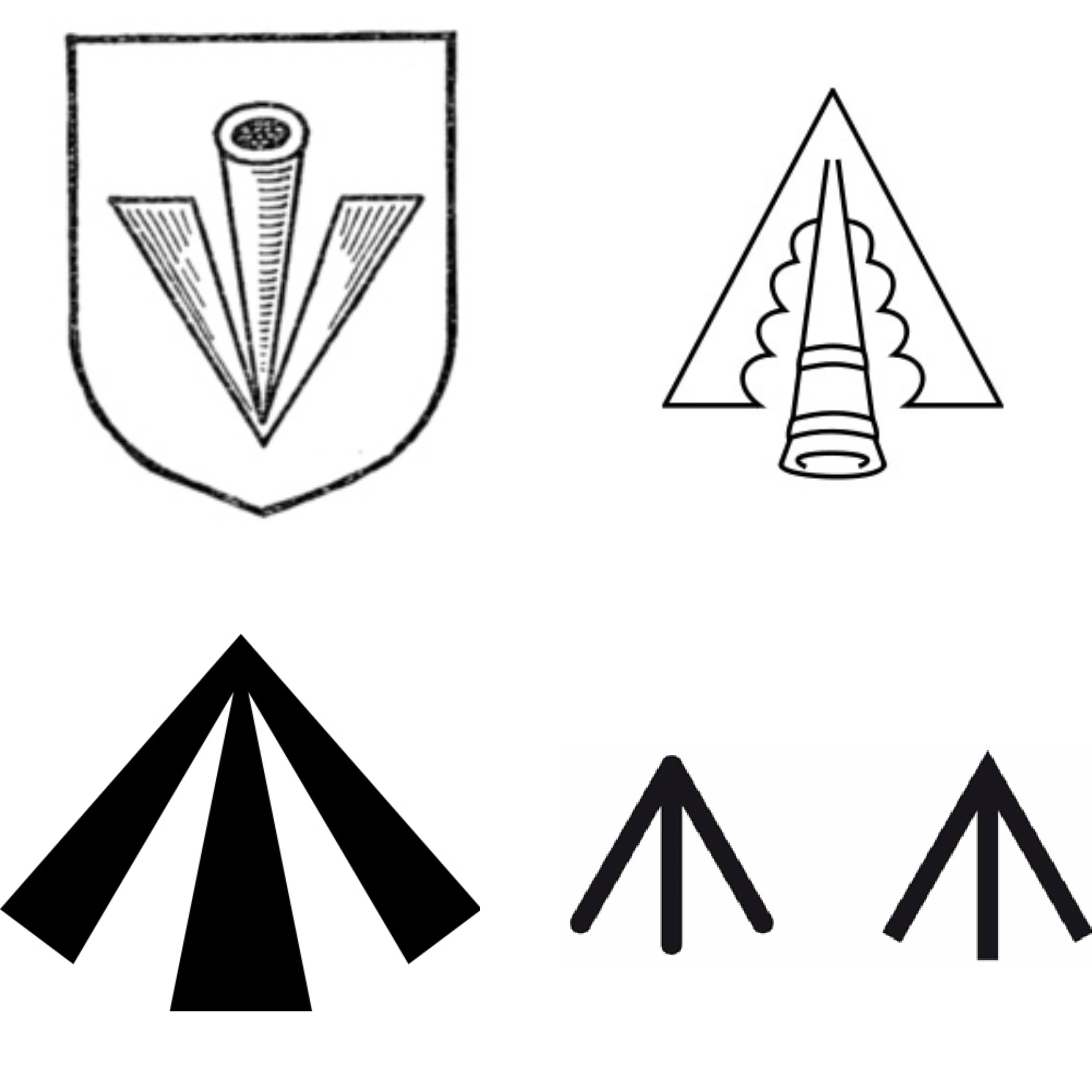
I also added the squiggle for the motif of a wattle fence, representing containment vs freedom, that I used on the buttons I cast for the coat. Here are some iterations and also tests of the font.


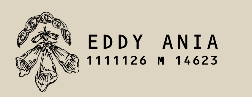
For the inside tag, I decided to keep the font simple, like something that might really be stamped in a garment. I'm planning to carve out a stamp just as soon as my linocut kit comes in the mail. I wanted to do stamps with numbers and symbols representing different information about the garment:
First number = collection number (1 for first collection
Second number = which piece in sequence
Third number = main material (1=wool, 2=linen, 3=cotton, 4=leather)
Fourth number = item type (1=coat, 2=shirt, 3=pants, 4=accessories)
Fifth and sixth numbers = year
And the second sequence of numbers is the zip code it was made in.
The Invitations will be little bags tied up with string, and one of each type of button inside. I just need to trace out the invitations on the fabric and then sew it onto wool to make the bag.